Why Your Tucson Business Website Is Losing 60% of Mobile Visitors
A practical mobile UX audit for Tucson service businesses: the speed fixes, CTA placement, and form-friction tweaks that turn lost mobile visitors into booked calls.

More than 70 percent of local searches in Tucson now happen on a phone. If your website was designed for desktop and then "made responsive" as an afterthought, you are very likely losing more than half of those mobile visitors before they ever see your phone number. Mobile website optimization is not a 2018 buzzword anymore. In 2026 it is the single biggest determinant of whether a local service business turns clicks into calls.
This guide is the mobile UX audit framework we run for every new Tucson client at Wildcat SEO. It covers the three biggest leak points (page speed, CTA positioning, form friction), the full audit checklist, real Tucson before-and-after results, and the conversion strategies that turn a typical 1 to 2 percent mobile conversion rate into 4 to 6 percent within a quarter.
Why Tucson Sites Lose Mobile Visitors in the First 5 Seconds
Mobile visitors are not patient. They are usually on a Tucson sidewalk, in a truck, at a kid's soccer game, or in a waiting room. They will give your homepage exactly one chance, and if anything feels slow, awkward, or hard to tap, they hit back and try the next result in the map pack. That is where 60 percent of mobile traffic quietly disappears.
Mobile-first indexing changed the rules
Google has been using mobile-first indexing across the entire web for years now. That means Google ranks your site based on the mobile version, not the desktop one. If your mobile site is missing content, has broken layouts, or is dramatically slower than desktop, your rankings on every device take the hit.
Mobile user behavior in Tucson
Tucson searchers behave a little differently than national averages. Voice search and "near me" queries are heavier here because of long drives between Oro Valley, Marana, Sahuarita, Vail, and central Tucson. People search for emergency services in monsoon season at 11pm. Snowbirds search from the road on their way down. All of this traffic lands on mobile, and almost all of it is one-tap-from-leaving.
What "bounce" actually looks like
In our audits we see four recurring causes of mobile bounce: the page takes more than 3 seconds to show real content, the hero image covers everything important on a phone screen, the phone number is not tappable or not visible above the fold, and the contact form looks like a tax return. Fix those four, and most local accounts pull mobile bounce rate from 65 to 75 percent down to 35 to 45 percent within 60 days.
Page Speed: The Single Biggest Mobile Conversion Lever
Speed is not a vanity metric. Every additional second of mobile load time costs roughly 10 to 20 percent of your conversions. On a typical Tucson HVAC site that translates to real lost calls every single day. Google measures this directly through Core Web Vitals, which feed both ranking and the Quality Score on Google Ads.
Largest Contentful Paint (LCP)
LCP measures how long it takes for the largest meaningful element (usually the hero image or headline) to appear on screen. Google's "good" threshold is under 2.5 seconds on mobile. We routinely see Tucson sites at 5 to 8 seconds because of unoptimized hero images and slow shared hosting. The single highest-leverage fix here is converting hero images to WebP or AVIF and serving them at the right size for mobile (not desktop-resized).
Interaction to Next Paint (INP)
INP replaced First Input Delay in 2024 and measures how snappy your site feels when someone taps a button, opens a menu, or starts typing in a form. Target: under 200 milliseconds. Heavy JavaScript (especially page builders loaded with third-party plugins) is the usual killer. The fix is auditing every plugin's JS footprint and deferring or removing anything that runs on every page load but is only needed on specific pages.
Cumulative Layout Shift (CLS)
CLS measures how much your content jumps around as the page loads. Target: under 0.1. The most common cause we see on Tucson sites is web fonts loading after the text renders, pushing everything down a beat later. Adding `font-display: swap` and reserving space for late-loading elements (ads, embeds, hero images with explicit dimensions) usually fixes it.
Image compression and lazy loading
90 percent of mobile speed problems are image problems. Convert PNGs and JPEGs to WebP, resize them to actual display size on mobile, and set loading="lazy" on every image below the fold. Hero images should be eagerly loaded but compressed aggressively. This one change often pulls LCP from 6 seconds to under 2.
Hosting and caching
Cheap shared hosting is a hidden CPC tax. A $5/month bargain plan adds 1 to 2 seconds to every server response on mobile. We typically move Tucson clients to LiteSpeed-based or managed WordPress hosting and pair it with full-page caching (LiteSpeed Cache, WP Rocket, or Cloudflare APO). Combined with a proper CDN, server response time drops to 100 to 300 ms even on phone networks.
JavaScript optimization
If your site is built on a page builder (Divi, Elementor, LiveCanvas), JavaScript is your biggest INP risk. Defer non-essential scripts (chatbots, analytics, video embeds) until after first interaction. Use Google's PageSpeed Insights to identify the worst offenders, then either remove them or load them only on the pages that need them.
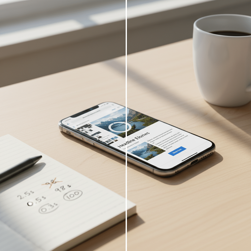
CTA Positioning: Make the Phone Number Impossible to Miss
Once the page loads fast, the next question is: can someone take the next step in one thumb tap? For a Tucson service business that next step is almost always "call now" or "request a quote." Make either one easy and your mobile conversion rate jumps overnight.
Above-the-fold CTA placement
Your primary CTA should be visible without scrolling. On a phone, that means within the first 600 pixels. Most Tucson sites bury the phone number behind a hamburger menu and put the contact form three scrolls down. Move them up. The conversion lift is immediate.
Sticky mobile buttons
A sticky bottom bar with a Call Now button is the single highest-converting element you can add to a local service site. It stays in the thumb zone no matter how far the user scrolls. On HVAC, plumbing, and dental sites we typically see 2 to 3x more phone conversions within 30 days of adding one.
Click-to-call optimization
Every phone number on the page should be a real tel: link. Sounds obvious. Half the Tucson sites we audit still have phone numbers as plain text or images, forcing the user to memorize or copy-paste. Combine a real tel link with a call-tracking number so you can attribute calls back to the marketing channel.
CTA contrast and visibility
A CTA button that blends into the background converts about half as well as one with high contrast. Use brand orange or blue on a neutral background. Make the button at least 48 pixels tall. Give it a sentence-case action label ("Get My Free Quote") not a generic "Submit."
Thumb-zone optimization
Studies of mobile ergonomics show the bottom third of the screen is where 75 percent of taps actually happen. Put primary CTAs there. Top-of-screen menus and links require thumb gymnastics on a 6-inch phone and are tapped 40 to 60 percent less often than bottom-anchored ones.
CTA sequencing and multi-step paths
Not every visitor is ready to call. Layer your CTAs: sticky Call Now for the ready-to-buy, a short "Get a Free Quote" form for the warm leads, and a softer "Download our Tucson HVAC pricing guide" or "Schedule a free site visit" for the researchers. Multi-step conversion paths catch more leads than a single Call Now button alone.
Mobile lead-capture psychology
Mobile users are skeptical. Pair every CTA with a trust signal: a star rating, an Angi or Google review count, or a "Serving Tucson since 2008" line. Trust signals next to the button increase tap-through rate by 15 to 30 percent in our split tests.
Form Friction: Where Most Tucson Mobile Leads Quietly Die
If a visitor scrolled past the hero, made it past the trust signals, and decided to fill out your form, you have already done most of the hard work. Then your 12-field "Contact Us" form scares them away. Form friction is the most expensive 30 seconds of UX in your whole funnel.
Long forms versus short forms
Every additional form field cuts mobile completion rate by roughly 10 percent. Ask for the minimum: name, phone, what they need help with. Address, project budget, "how did you hear about us," and the famous "any other details?" textarea can wait until the follow-up call. Three fields beats ten on mobile, every single time.
Autofill optimization
Use the correct HTML autocomplete attributes (name, tel, email) so Safari and Chrome on mobile fill the fields for the user. This single technical change can lift completion by 15 to 25 percent. It is one line of HTML per field and most local sites skip it entirely.
Multi-step forms
Counterintuitively, a 5-step form with one question per step often outperforms a single-page form with 5 fields. Each step feels lighter, the user has invested incrementally, and they finish what they started. Use multi-step forms for higher-friction asks like roofing estimates or legal consultations.
Mobile keyboard optimization
Set the right inputmode on every field. Phone fields should bring up the number pad, email fields should bring up the @ key, zip codes should show numeric. The default text keyboard makes phone numbers and zip codes painful to type on mobile and accounts for a meaningful chunk of abandonment.
Inline error handling
When a user fills the form wrong, do not wait until they tap submit to tell them. Validate inline and show errors in plain English ("Please add the area code to your phone number") right next to the field. Forms that validate inline see 22 percent lower abandonment in published industry tests.
Real mobile usability testing
Test your own form on your actual phone, in actual Tucson sunlight, with one hand, while standing up. That is the real use case. Anything that takes more than 30 seconds, or makes you reach across the screen, or requires zooming in, is a problem. Fix the friction you yourself feel and the lead numbers follow.

The Wildcat Mobile UX Audit Checklist
Run your own site through this checklist. Anything you check "no" on is leaving money on the table.
- Mobile page speed: LCP under 2.5s, INP under 200ms, CLS under 0.1 on PageSpeed Insights mobile.
- Responsive layout: Test at 360px, 390px, 414px widths. Nothing horizontal-scrolls, nothing overlaps.
- CTA visibility: Primary CTA visible in the first 600px without scrolling.
- Mobile readability: Body text at least 16px, line-height 1.5+, contrast ratio 4.5:1 or higher.
- Tap-target spacing: Buttons and links at least 48x48px with 8px of breathing room around them.
- Form usability: 3 to 5 fields max, autofill enabled, correct inputmodes, inline validation.
- Click-to-call setup: Every phone number is a real
tel:link with a tracking number. - Image optimization: WebP/AVIF, lazy loading below fold, properly sized for mobile.
- Mobile trust signals: Star ratings, review counts, "Serving Tucson since X" near every CTA.
- Conversion tracking: GA4 events on every tap of phone, form submit, click-to-call.
- Mobile navigation: Hamburger menu opens in under 200ms, easy thumb-reach close button.
- Mobile SEO readiness: Schema markup, mobile-friendly test passes, structured data validated.
Tucson Before and After: Real Mobile Conversion Lifts
Tucson roofing contractor. Pre-audit: LCP 6.4s, mobile bounce 71 percent, no sticky CTA, 9-field contact form. After audit: WebP hero, deferred chatbot JS, sticky Call Now bar, 3-field form. Mobile bounce dropped to 38 percent and monthly form submissions tripled within 45 days.
Catalina Foothills dental practice. Pre-audit: site loaded at 5.8s mobile, no click-to-call link, single 11-field "Request an Appointment" form. After audit: managed hosting, sticky Schedule Online button, 3-step form with Calendly integration. Online bookings went from 4/month to 28/month.
Tucson personal injury attorney. Pre-audit: hero video that autoplayed on mobile (4.5MB), no visible phone above the fold, contact form needed a date picker that crashed Safari. After: static optimized hero image, top-anchored phone number plus sticky bottom Call button, simplified form. Mobile leads doubled in 6 weeks.
Mobile Conversion Strategies That Work in 2026
Mobile-first design systems
Stop designing on desktop and then "checking mobile." Design the mobile layout first, in real device viewports, and let desktop be the larger version. Every component (hero, cards, forms, CTAs) should have a mobile spec before it has a desktop spec.
Faster-loading hero sections
The hero is the single most expensive part of your mobile page. Skip autoplay video. Use a single optimized WebP image. Limit the text to one headline, one subhead, and one CTA. Heavy heroes with multi-slide carousels are the most common cause of bad LCP on Tucson local sites.
AI chatbot integrations
A well-tuned AI chatbot can capture mobile leads at 2am when no one is in the office. The key is loading it lazily (after the page is interactive), keeping the first message under 2 lines, and routing qualified leads directly to SMS or email instead of trying to do the entire conversation in-app.
Mobile scheduling systems
For appointment-based businesses (dental, legal, medical, home services), an embedded mobile scheduler (Calendly, Acuity, Square Appointments) often outperforms a phone-call CTA on mobile by 1.5 to 3x. Schedulers feel less committal and convert younger demographics better.
Trust indicators above the fold
Star ratings, BBB badges, review counts, and "Serving Tucson since 2008" lines belong in the hero, not at the bottom of the page. They establish credibility in the first 2 seconds and lift CTA conversion 15 to 30 percent. Pair them with a real customer photo when possible, not stock imagery.
Conversion-focused layouts
Every section of your mobile homepage should answer a question: who you are, what you do, who you do it for, what it costs to start, and how to get in touch. Cut anything that does not move the visitor closer to one of those answers. Mobile real estate is precious. Our smart websites are designed around this principle from day one.
Tucson Mobile UX FAQ
How fast should a Tucson business website load on mobile?
Under 3 seconds for first meaningful content, ideally under 2.5 seconds for Largest Contentful Paint. Anything slower and you lose 10 to 20 percent of mobile visitors per additional second. Test on Google's PageSpeed Insights using the mobile tab, not desktop.
Is responsive design enough for mobile in 2026?
No. Responsive design only ensures your site does not break on small screens. Mobile UX in 2026 means designing specifically for thumb taps, sub-3-second loads, and one-handed interaction. A site can be "responsive" and still lose 60 percent of mobile traffic.
Should I have a separate mobile site or one responsive design?
One responsive design, optimized mobile-first. Separate "m.dot" sites are obsolete and split your SEO equity. Google has explicitly recommended a single responsive site since 2017.
How do I know if my Tucson site has a mobile problem?
Open Google Analytics and compare mobile bounce rate to desktop bounce rate. If mobile is 20+ points higher, or mobile conversion is half desktop, you have a mobile UX problem. Also check PageSpeed Insights and look for any red Core Web Vitals.
Does mobile UX affect Google rankings?
Yes, significantly. Mobile-first indexing means Google ranks your site based on the mobile version. Slow mobile speeds, layout shifts, and bad usability all directly hurt rankings, even for desktop searchers.
What is the fastest mobile UX win for a local Tucson business?
Add a sticky bottom Call Now bar with click-to-call. It typically lifts mobile phone conversions by 2 to 3x within 30 days and takes under an hour to implement.
Want a Free Mobile UX Audit of Your Tucson Site?
We will run your site through the full Wildcat checklist, prioritize the fixes by conversion impact, and send you a one-page action plan. No charge, no obligation, Tucson local team.